Packaging guide
Foil, Spot UV, Soft Touch and Embossing on Beauty Packaging
The four finishes beauty brands ask for most, what each adds, what the artwork needs and when to leave it out.
What does a finish actually do on a cosmetic box?
A finish is anything applied after the ink.
It changes how the box feels, how it catches light and how long the print stays clean. Beauty buyers handle boxes before buying, so feel matters more here than in most packaging.
Four finishes account for nearly every request: foil stamping, spot UV, soft touch lamination and embossing or debossing. Gloss and matt lamination sit underneath them as the base coat.
Each one is priced on the quote as an option. This guide explains what they do, what the artwork needs and where each one is wasted.
When is foil stamping worth it?
Foil is a thin metallic or pigment film pressed onto the board with a heated die.
Gold, silver, rose gold and copper are the usual colours; black, white and holographic foils exist too. The result is a flat, mirror-bright shape that ink cannot match.
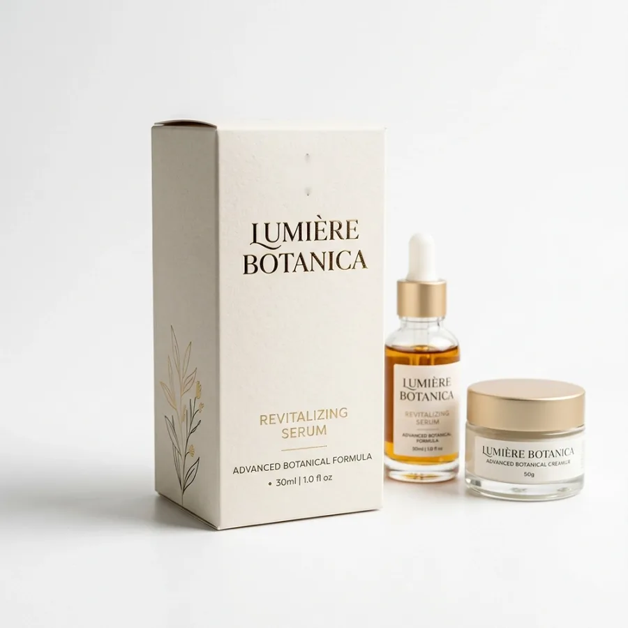
It is worth it on the logo and the product name, on dark boards where metallic ink would go dull, and on perfume and gift boxes where the shelf is competitive. It is wasted on body text, on fine lines under 0.3 mm and on large solid areas, where the foil can show pinholes.
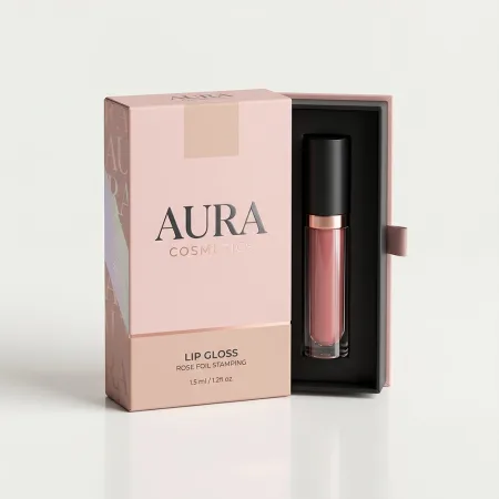
Artwork for foil goes on its own layer as a solid 100 per cent black shape, with no gradients. Keep type above 8 pt and strokes above 0.3 mm. The lip gloss boxes with a foil brand name show the finish doing its best work: one word, big, on a soft background.
What is spot UV and where does it work?
Spot UV is a clear gloss varnish applied only where the artwork says, then cured under ultraviolet light.
On a matt box it reads as a shiny shape against a flat background; on a gloss box it disappears, so it is almost always paired with matt lamination.
It suits patterns, textures and logos you want to be seen only at an angle. A lace or botanical pattern in spot UV across a whole panel gives a box depth without adding a colour. It also works as a quiet second logo on the back panel.
Spot UV can go over foil, with care. Artwork is a separate layer, solid black. Registration to the print is about 0.5 mm, so keep a small gap between a UV shape and a printed edge rather than trying to align them exactly.
Why do skincare brands choose soft touch lamination?
Soft touch is a matt film with a velvety, slightly rubbery feel.
It is laminated over the whole printed sheet before cutting. The feel is the point: it reads as premium in the hand before the box is even looked at.
It also mutes colours by a few per cent and deepens dark backgrounds, which suits the muted palettes most skincare and fragrance brands use. On bright pink or yellow it can look flat, so ask for a proof on the right board.
Two cautions. Soft touch marks more easily than matt on black, so fingerprints show on a dark box after handling. And fine reversed type under 7 pt tends to fill in. The skincare boxes in a matching house style are the typical place for it, usually with a foil logo on top.
Embossing or debossing: which one, and when?
Embossing raises a shape out of the board using a male and female die; debossing presses it in.
Both are felt as much as seen, and both work with or without ink or foil on the raised area.
Embossing suits a logo or a monogram on the front panel of a carton or on the lid of a rigid box. Debossing suits patterns, or a single line of type, on thick, uncoated or textured board, where it looks pressed rather than printed.
Depth is limited by the board. A 400 gsm carton takes a shallow emboss of about 0.3 mm; a rigid box wrap over greyboard takes deeper, more sculpted work. Keep embossed shapes at least 1.5 mm wide and avoid placing them on a crease or within 5 mm of a cut edge.
How do the finishes compare?
This table sums up where each finish helps and what the artwork needs.
All of them are priced on the quote as options, and the proof marks their positions before anything is made.
| Finish | What it adds | Best on | Artwork needs |
|---|---|---|---|
| Matt lamination | Flat, smudge-resistant base | Any carton or rigid wrap | None; whole sheet |
| Gloss lamination | Shine, colour pop, wipe-clean | Bright makeup and bath boxes | None; whole sheet |
| Soft touch lamination | Velvety feel, deeper darks | Skincare, fragrance, gift boxes | None; whole sheet |
| Foil stamping | Metallic logo or name | Dark boards, perfume, gifts | Solid black layer, 8 pt and up |
| Spot UV | Gloss shape on a matt box | Patterns, logos, back panels | Solid black layer, 0.5 mm registration |
| Embossing | Raised logo you can feel | Front panels, rigid lids | Vector shape, 1.5 mm minimum width |
| Debossing | Pressed pattern or type | Thick, uncoated or textured board | Vector shape, away from creases |
How do you prepare artwork for a finish?
Every finish is a separate pass on the press or a separate die, so each one needs its own layer in the file.
This is the order that avoids a second round of proofs.
- Build the artwork in vector where possible, at the dieline size, with 3 mm bleed on every outer edge.
- Put each finish on its own named layer: Foil, Spot UV, Emboss. Fill the shapes with 100 per cent black and no transparency.
- Keep foil type at 8 pt or larger and spot UV lines at 0.5 mm or wider.
- Keep embossed or debossed shapes 5 mm clear of creases, cut edges and glue flaps.
- Export a PDF with the finish layers included and a second PDF with them hidden, so the proof can show both states.
- Tell us the board and the base lamination when you send the file, because both change how a finish behaves.
Which finish mistakes cost the most?
Most finish problems are caught on the proof, but they still cost a day.
These are the ones worth avoiding before the file is sent.
- Foil on body text, where the letters bleed into each other
- Spot UV on a gloss-laminated box, where it cannot be seen
- Soft touch on a bright colour that needed to stay bright
- An emboss placed across a fold, which cracks the board
- Finish layers built in a raster file rather than vector
- Three finishes on one small lipstick carton, where one would do
Which finish suits each kind of beauty box?
A rough rule: one base lamination plus one feature finish per box.
Skincare takes soft touch with a foil logo. Makeup takes gloss or matt with full-colour print and a foil name. Perfume takes matt or soft touch with foil and an emboss on rigid lids.
Bath and body usually needs nothing beyond a matt lamination or none at all on kraft, because the product and the window sell the box. Gift boxes carry the most: a wrap with foil, an emboss and a soft touch feel is normal.
For a full-colour patterned carton where the print is the feature, the printed cosmetic boxes with edge-to-edge colour show how far ink alone can go. Add a finish only when it says something the print cannot.
How do finishes affect cost and lead time?
Every finish adds a step after printing, and some add a die.
Foil and embossing each need a metal die made to your artwork, which is a one-off cost that is not repeated on reorders if the artwork stays the same. Spot UV uses a screen or plate that is cheaper to make.
Lamination is applied to the whole sheet and adds little time. Foil, spot UV and embossing each add a pass through a separate machine. Even with all of them, the boxes are made inside the usual 4 to 6 business days that follow your proof approval, with the heaviest combinations at the longer end.
The starting price of £0.25 per unit applies, and the quote itemises each finish so you can take one out and see the difference. The proof shows the finish positions marked in colour, so check them against the dieline before approving.